
Every video loses people early
There is always a cliff at the beginning of a YouTube video. Some people clicked by accident. Some came through autoplay. Some liked the thumbnail but realized quickly that the video was not for them. Some were curious enough to click, but not interested enough to stay. That loss is normal.
So when I open a retention graph, I am not asking why people left in the first 30 seconds. Of course some people left. I want to know: did this video lose viewers differently than this channel normally does? That is a much more useful question.
And it is why I care far more about a channel’s own history than somebody else’s benchmark. A 65% intro might be fantastic for one channel and weak for another. The channel tells you what normal looks like.
The 30-second number is a flag, not a verdict
YouTube gives the intro its own reading in Studio. Useful. But I think it is very easy to give that label more authority than it deserves. “Above typical.” “Typical.” “Below typical.” Those sound like conclusions. They aren’t. They are flags.
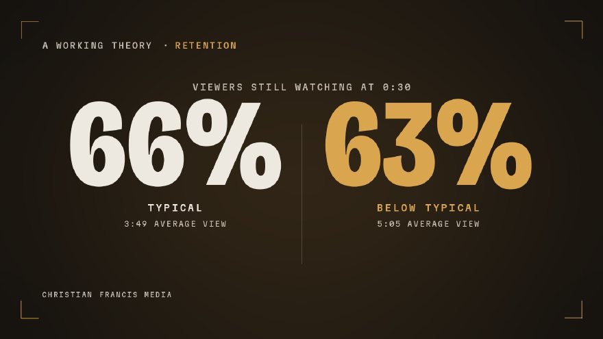
If a video is dramatically outside the channel’s normal range, I absolutely want to investigate it. But near the edge of those ranges, tiny changes can flip the label. That is exactly what happened in the client example I mentioned earlier. 66% was typical. 63% was below typical. Three percentage points changed the verdict Studio displayed. But they did not suddenly make one intro effective and the other ineffective.
So I stopped asking whether YouTube liked the first 30 seconds. I started asking what the curve itself was telling me.
The three things I check
1. Where does the cliff bottom out? The first drop is expected. What matters is where it stops. I compare that point against similar videos from the same channel. Same general format. Similar audience. Similar runtime when possible. If most of the channel’s videos settle into roughly the same range and this one collapses well below it, now I have something worth investigating. But I do not panic because one video is three points lower at exactly 0:30. I want to see where the opening actually stabilizes.
2. Where does the curve flatten? At some point, the bleeding should slow down. The viewers who remain have basically decided: I’m watching this. If that happens around 30 or 40 seconds, the opening probably did its job. If the graph is still steadily sliding at 60, 75, 90 seconds, I start asking a different question: has the video actually delivered what the title and thumbnail promised yet? Because now we may not have an intro problem. We may have a video that is taking too long to get where it said it was going.
3. How are people leaving? This is the part I think gets missed constantly. Not all early drop-off means the same thing. If the biggest loss happens immediately, especially in the first 5 to 10 seconds, I start looking at the promise. What did the thumbnail say? What did the title imply? What did the viewer expect to see? And what did we give them in the first frame? If those things do not line up, cutting the intro faster is not going to fix the real problem. The packaging brought in someone expecting one thing and the video immediately gave them another. That is a promise problem.
But if viewers leave gradually through the first 30 seconds, I start looking harder at pacing. Maybe we are getting to the point. Just too slowly. Those are two completely different diagnoses.
This is where people start fixing the wrong thing
Studio says “below typical.” So the reaction is: cut faster, add a harder hook, get rid of the intro, start with a cold open. Maybe that works. But maybe the intro was never the problem.
If people are leaving almost instantly, I want to know whether the thumbnail and title created an expectation the first few seconds could not satisfy. Because if the promise is wrong, rebuilding the intro underneath the same promise can create the exact same retention curve again.
You have to read retention with packaging. Otherwise you are looking at half the system and trying to diagnose the whole thing.
Percentage viewed can fool you too
This is another lesson client work beat into me. A longer video can have a lower 30-second retention number, a lower average percentage viewed, and still hold the average viewer for substantially more time. Which one is better? It depends on what you are trying to build. That is why I do not like single-metric verdicts.
If Video A gets 38.3% viewed and Video B gets 31.8%, it is tempting to say Video A retained better. But if Video B is six minutes longer and produces a 5:05 average view duration compared with 3:49, now we have a much more interesting conversation.
Percentage viewed tells me something. Absolute watch time tells me something else. The retention curve tells me something else again. None of those numbers should be asked to explain the entire video by themselves.